
by Mark Galauner | June 29, 2019
There are literally multitudes of books that explain how to present data correctly. Apparently, nobody actually reads those books. Despite computer programs that give us an increased ability to create charts, we seem to have very few good graphs and charts. In our hyperlinked world, I often find myself just taking most charts at face value. I am trying to slow down that hyperlinked world a little bit and that includes trying to better understand what it is I am reading. As a result, I have started asking all sorts of semantic questions about things. There is a technical term for this kind of person… we generally refer to them as “jerks” who ask too many questions!
Below is a chart I came across recently that depicts “America’s” most popular beers. I am not sure how “American” it can really be when a famous American patriot (Sam Adams) finished behind both a Dutch and Irish import, and tied with a Mexican import. But he did beat out Coors, and Coors is partly responsible for the Citizen Kane of car chase movies (Smokey and the Bandit), so Mr. Adams has at least that going for him.
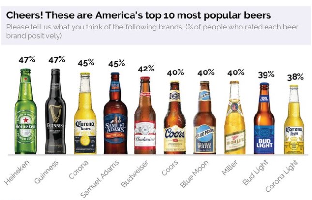
According to the title, the beers are rated based on how positively they are rated by Americans (and not whether they are named after positive Americans). But still something just didn’t seem right… so I started asking questions and realized that there are a few basic chart guidelines that would make it easier to understand what this chart actually means.
The chart is missing a baseline and label for the Y axis. Without a baseline, I don’t know if the size of the bottles is actually representative of their score. Are the sizes of the Heineken and Corona Light bottles proportional to each other based on their scores? As it stands now without the baseline, I think Corona Light scores lower because it is a smaller bottle and you get less (plus it’s a lite beer).
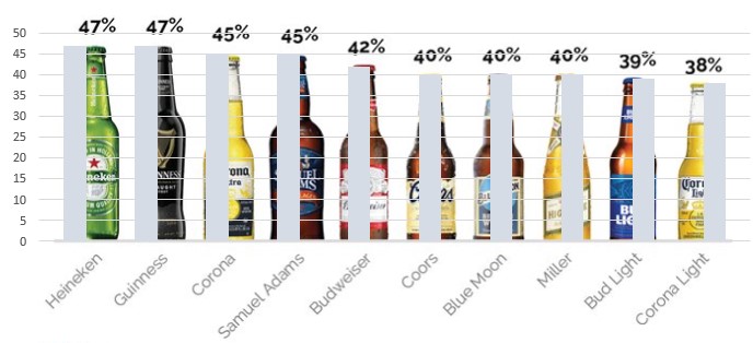
As it turns out, the bottles are pretty much proportional and represent accurate scores, but I had no way of knowing that until I created a baseline and Y axis based on the scores and superimposed it over the chart (see below).
A bigger concern is the actual percentage scores. The chart claims to present “the percentage of people who rated each beer brand positively”. But upon further reading, it is revealed that the score does not represent a straight percentage. The rating was based on both recognition and positivity. As a result, respondents were asked if they were familiar with the beer before they could be asked if they had positive, or negative opinion of it. Thus, the percentages above are a combination of both name recognition and positive opinion of the brand. As a result, the 40% for Miller does not mean that 40% of all respondents liked Miller, but is actually a composite percentage determined by the recognition percentage multiplied by its positivity percentage. So that 40% could mean that 100% of respondents were familiar with Miller and 40% viewed it positively (1 x .4 = 40%), or that 50% of respondents were familiar with Miller and 80% viewed it positively (.5 x .8 = 40%). So not only does this methodology clearly favor well-known brands, it also appears that all ‘forty percents” are not created equal!
Data programs now have given anybody with a spreadsheet program the ability to churn out charts at a pace that far exceeds our mental capacity to understand them. Because of all this possible clutter, the ability to ask the right questions to quickly discern what the data are telling us is more valuable than ever… whether it is important business decisions like trying to determine the proper target markets for new marketing opportunities or even more important decisions… like which beer to drink.
Other Resources
- Date
- September 7, 2023
by David Ham | September 7, 2023 With the amount of money involved in professional sports contracts, the current trend toward deeper analysis makes good business sense. However, […]- Date
- June 2, 2023
by David Ham June 1, 2023 I will start by stating the obvious, inflation is forcing consumers to make tradeoffs and difficult decisions. This puts businesses […]- Date
- August 1, 2022
by David Ham August 1, 2022 Five years ago, I wrote a blog that asked, Is This a ‘Hook-Up’ or a Long-Term Relationship? The post was […]- Date
- May 24, 2022
by Omar Khan May 24, 2022 A few years before getting my first job as a consultant, I spent a summer abroad in the United Arab […]


